One of my goals for the year is to improve my hand lettering skills. I’m not where I want to be yet (hey, it’s only May) but I feel like I’ve improved a lot this year already. If you’re afraid to jump in and try it yourself, don’t be. Like anything, all it takes is practice.
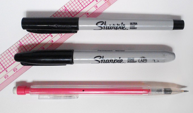
An easy way to get started is with something called “faux-ligraphy.” The look mimics classic calligraphy but in a looser style and can be achieved with the humblest of supplies. If you have pencil and paper, you can do this. In the examples below, I’ve used pencil and a couple sizes of Sharpies. A ruler is also handy.

To start, simply draw a line across your paper with a pencil. Then just write out your word or words in your prettiest handwriting. I chose the loveliest word of all, love. Feel free to lay it out first in pencil, as I did here.

Don’t stress about perfect spacing and letter height. Part of the charm of hand lettering is the handmade look little imperfections create. Just do your best.
Next is where the magic begins. On every downstroke, every time you pull your pen or pencil towards your body, you want to add width to that line. Like this:

Leave the upstrokes and horizontal lines thin. I love the look of the letters just like this or you can take it a step further. Simply fill in the spaces.

It’s really as simple as that!
Practice your lettering by dressing up birthday cards or even your electric bill. Write out all your favorite quotes, poems, and verses. Add flourishes, vines, and leaves. Or combine your letters with drawings and doodles.
Here are a few of mine from the past month or so:


Give it a try and show me your work. I’d love to see what you create! <3


